Visualize embeddings of individual tokens
How do different LLMs represent similar tokens? In this note I visualize the embedding and the hidden representation of tokens inside the models.
The main approach to visualize is first capturing the embeddings & hidden representations, and second reducing the high dimensions to 2D with PCA to plot on scatter plot.
I’m interested in how token meanings are represented inside the model. Though it is generally understood (or assumed) that similar tokens are close to each other in the manifold, it would be nice to actually see it.
Specifically, we will visualize categories of words to see whether the embedding and hidden representation of cluster according to their category, using the Qwen3-4b-Instruct model. The following words will be examined:
Words by category
WORDS_BY_CATEGORIES = {
  "boy_first_names": [
    "James", "John", "Michael", "David", "Daniel",
    "Matthew", "Andrew", "Thomas", "Mark", "Paul",
    "Peter", "Kevin", "Brian"
  ],
  "girl_first_names": [
    "Mary", "Sarah", "Emma", "Emily", "Jessica",
    "Anna", "Laura", "Lisa", "Jennifer", "Karen",
    "Amy", "Rachel", "Susan"
  ],
  "countries": [
    "France", "Spain", "Italy", "Japan", "China",
    "Brazil", "Canada", "Mexico", "India", "Egypt",
    "Greece", "Turkey", "Peru"
  ],
  "capitals": [
    "Paris", "London", "Rome", "Tokyo", "Berlin",
    "Madrid", "Ottawa", "Cairo", "Athens", "Moscow",
    "Beijing", "Delhi", "Lima"
  ],
  "colors": [
    "red", "blue", "green", "yellow", "orange",
    "purple", "pink", "brown", "black", "white",
    "gray", "silver", "gold"
  ],
  "months": [
    "January", "February", "March", "April", "May",
    "June", "July", "August", "September", "October",
    "November", "December"
  ],
  "emotions": [
    "happy", "sad", "angry", "excited", "scared",
    "surprised", "confused", "proud", "worried", "calm",
    "nervous", "grateful", "lonely"
  ],
  "action_verbs": [
    "run", "jump", "walk", "swim", "dance",
    "sing", "eat", "sleep", "read", "write",
    "play", "talk", "laugh"
  ],
  "occupations": [
    "teacher", "doctor", "nurse", "chef", "pilot",
    "farmer", "artist", "writer", "lawyer", "engineer",
    "dentist", "police", "firefighter"
  ]
}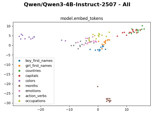
Visualizing the embedding, we can clearly see the “months” tokens occupy a separate cluster, staying far from the rest. The “colors” tokens also distinctively occupy a separated region. The “countries” and “capitals” tokens cluster together. The “boy_first_names” and “girl_first_names” tokens cluster with each other but still have a visible separation. The remaining “emotions”, “action_verbs” and “occupations” tokens mingle more heterogeneously with each other.
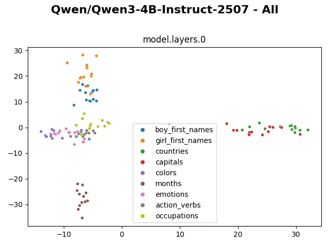
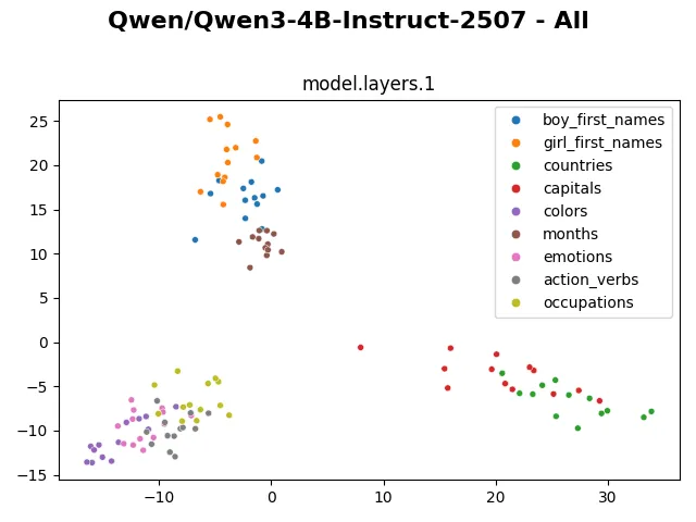
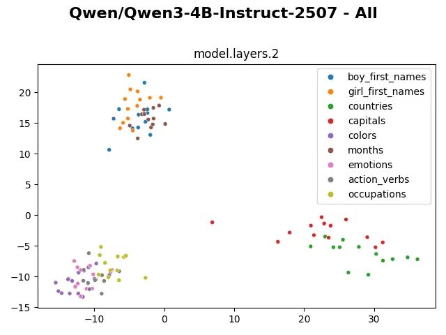
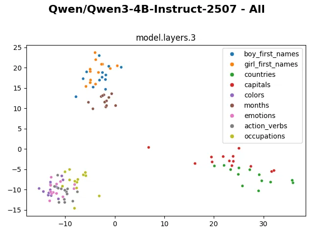
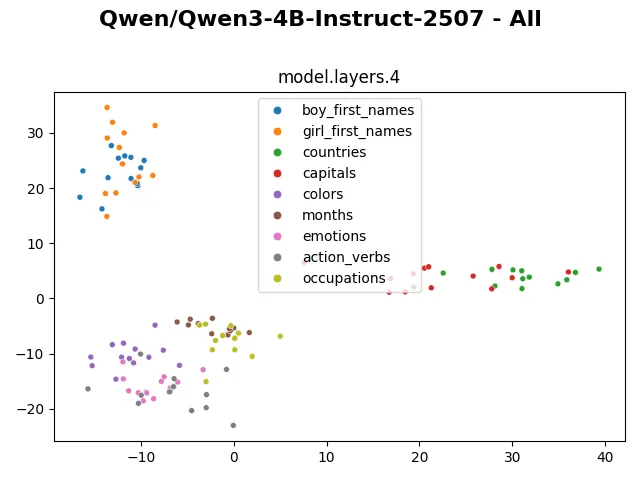
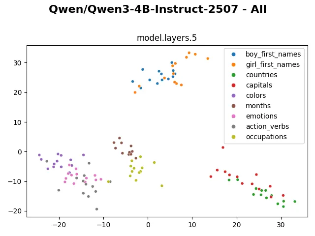
From layer 0 to layer 5, the internal representations are shuffled around, but generally they still form visibly distinctive clusters.
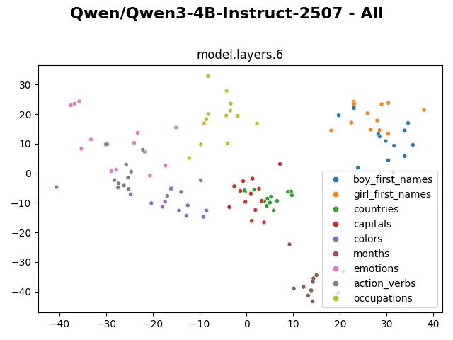
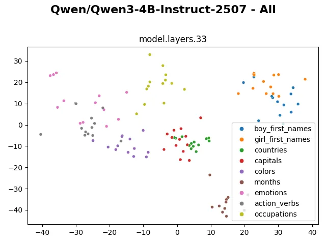
After layer 6, the internal representation suddenly becomes much more heterogeneous. And it stays visually very similar like that until layer 33. It seems the model mostly modifies non-dominant dimensions of the token representation. Earlier probes of Qwen3-4b also show significant change in hidden representation between layer 6 and earlier layers. This plot confirms the same, and I would like to investigate what exactly happens in this layer.
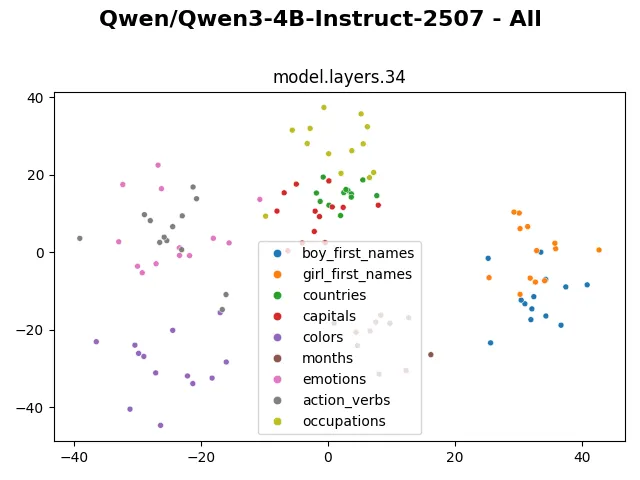
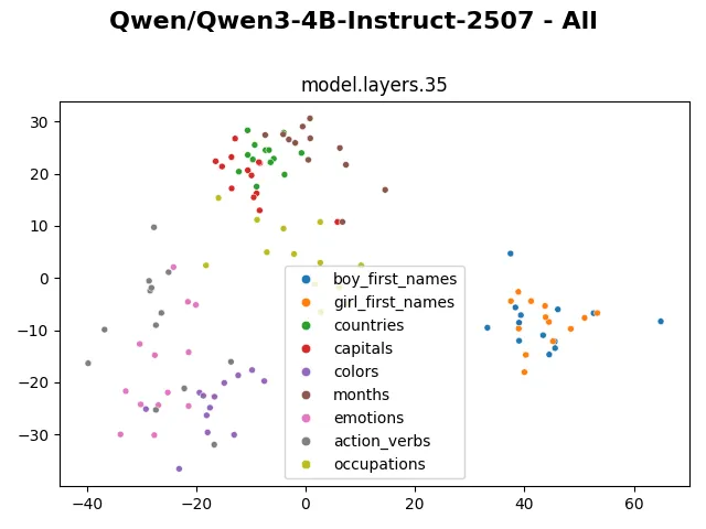
The representation changes more visibly in the last 2 layers, presumably to suit with the next token prediction task.
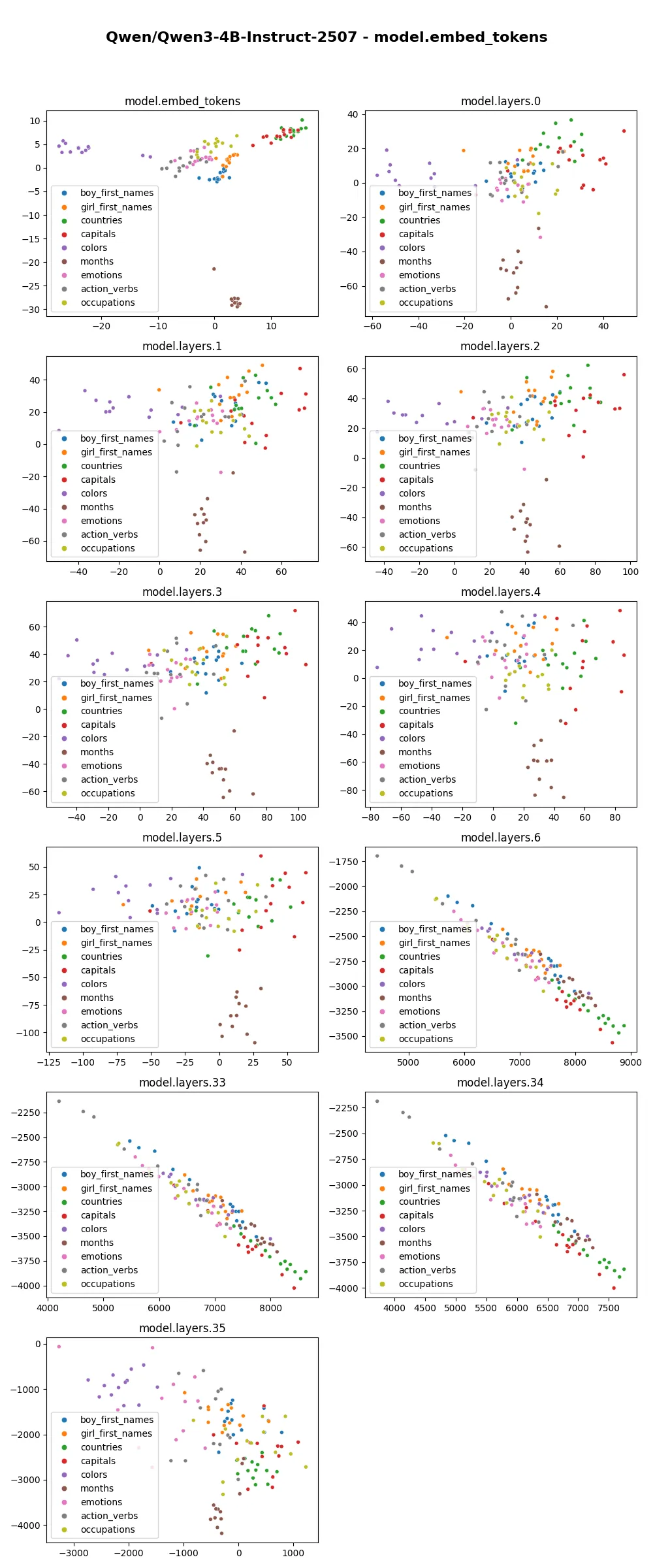
When each layer is plotted against the PCA projection of embedding layers, we can see the tokens gradually scatter in the first few layers, then become linear and grow greatly in scale from layer 6 onward. Related tokens still stay close to each other. Among these plots, the “linearization” of representation looks interesting. This behavior similarly shows up in other models of the Qwen3 family, but not in other families such as gpt-oss. I wonder how the training data and training strategy contribute to this phenomenon.
Looking at the visualization from larger models (such as gpt-oss-20b, gpt-oss-120b, olmo3-7b,…) also shows that the embedding and hidden representation of such categories are distinctly preserved. The clusters even remain distinctive in the representation of the last layer. I wonder if through these visualizations, we can in some way compare model capability, similar to how the fractured representation hypothesis shows a much cleaner representation of evolutionary-trained models compared to backprop-trained models.
(This post is accompanied by this notebook in case you want to replicate some visualizations or try the visualizations on other models).